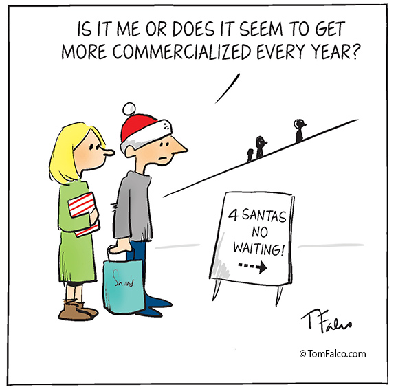
I changed the lettering starting with today’s comic. What do you think?
The image above has the old lettering and the bottom image has the new lettering. I think the new lettering fits more in line with the drawing style.
If you saw today’s comic before seeing this blog post, did you notice it right away? Did it seem cleaner? Did it seem like something was different? Or did you just not notice at all?
What do you think? I’m interested in your opinions.
Skip to content


I would not have noticed the font change, but on looking carefully, I think the new font is much more readable. Good job!
LikeLike
Thanks, Fred!
LikeLike
For older eyes, the old is better and easier to read
LikeLike
That’s what I was afraid of. I may try and compromise and make the new style larger so it’s easier to read.
LikeLike
The old one is easier to read. I use to set a lot of type.
LikeLike
I think the new font looks better Tom. I used to use a mix of upper & lower case but now I use a font that’s all upper case & now prefer it that way.
LikeLike
I’ve been going back and forth. The new one is the upper and lower case lettering.
LikeLike